
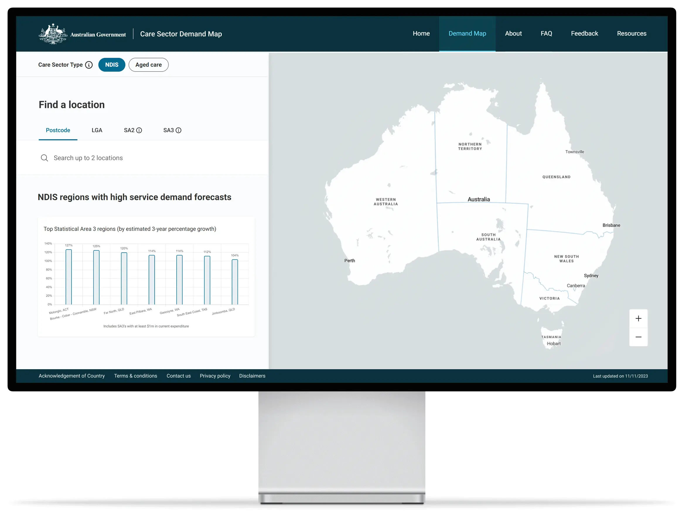
Gain local, actionable insights for your business
Explore the usage of care in different areas
Find out which services and supports have been used and by how many people - can your organisation tailor services to regional needs?
Navigate spending patterns
Understand the supports people in the care sector are currently using to support organisations in planning for the future.
Inform strategic workforce planning
Anticipate future workforce with the estimated number of workers required to meet demand needs in your area.

Frequently asked questions
-
- NDIS participant spending is broken down across 12 categories. These categories group the NDIS registration groups for simplicity and modelling robustness. Details on which registration group maps to which website service type can be found on the NDIS Registration Groups page.
- Most NDIS participants receive supports in more than one service type so summing the type counts will result in double counting. The number of individuals being supported in the specified region is available at the top of the ‘current’ data section.
-
- Currently there isn’t any data on the number of jobs or workers in the NDIS to inform workforce forecasts and future planning. To produce this forecast, the model estimates the NDIS workforce through analysis of participant spending and assumptions on the portion of NDIS payments paid as labour costs.
- Workforce estimates are provided for occupation groups. Some occupations with low numbers and/or more uncertainty about the specific occupation have been grouped together. For example, "other worker" includes occupations such as domestic cleaners, garden labourers and interpreters.
- To estimate workforce, the model calculates the full-time equivalent (FTE) workforce through analysis of scheme expenditure at the line-item (detailed service description) level.
-
- The NDIS forecast demand model for the Care Sector Demand Map incorporates participant forecasts by category type (i.e. age, disability, and Supported Independent Living (SIL) status) and Statistical Areas Level (SA3s).
- The participant categories align with the NDIA’s Annual Annual Financial Sustainability Review (AFSR) , including population growth and forecasts.
- The most recent financial year data of participants in the scheme is then weighted to account for participant growth in future years.
- Budgets are inflated in future years consistent with NDIA’s Annual Financial Sustainability Review (AFSR) to incorporate increases in wages and capital costs and any other movements.
- Analysis on current expenditure by participant category then converts demand for NDIS supports into monetary demand by service type.
- To ensure forecasts reflect future demand rather than likely expenditure and usage, adjustments are made for areas with low utilisation (where participants have spent less of their NDIS funding than expected). These adjustments are informed by analyses of expenditure and workforce usage (e.g. physiotherapy) against the same participant groups in mature and metropolitan regions.